Submitted by Florian on
It has been a while, so let me give you guys another update.
We are now at a point where (1) we can make awesome looking maps and (2) most of the core game mechanics are working nicely. So that means these last few weeks we have mostly been focussing on improving the playability of our internal prototype. For example, internal play testing revealed that the hotkey scheme we initially developed might work for advanced players, but could be confusing to pretty much everyone else. So we revamped it and while doing so also improved the system to be able to map pretty much any action you can do in the game. So it will now be possible to pretty much customize it however you want. We just have to figure out some nice default schemes for players to choose from!
We've been also tweaking all the important underlying algorithms that make for a nice game. This includes stuff like aim time, hit % and suppression. These need to be nicely balanced for combat to work properly. We can get a lot of inspiration from the old game here of course, but we also want to improve on it. For example, soldiers will now fire more quickly at targets near them to properly model the sense of urgency of close combat.
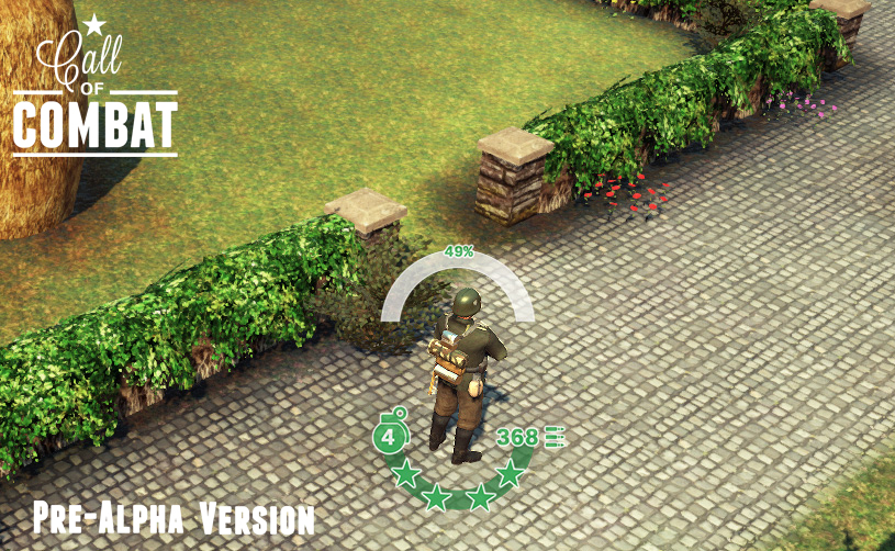
But all these changes are peanuts compared to the challenges of developing a nice UI! This is taking up most of our time right now and will do so for another few weeks or so for sure. My focus in this post will be on the soldier UI, as we'll talk more about the rest of the UI in the coming weeks. Our main goal has always been to get as much information as we can displayed on the map itself. Unlike your average RTS game you control just a few soldiers in Call of Combat, so you need to manage them well! This means so you want to see their status quickly and at a glance. You want to know who is whom, how many bullets and grenades they have left, whether they are suppressed and who they are aiming at and how likely they are to actually hit.
I've posted a teaser of this in the forum already a week or two ago (check out the new forum if you haven't already!) and things have a evolved a bit since then. This will clearly be a process of a lot of trial and error and continuous tweaking, but let me show where we stand now on that:
Besides showing the chance you have to hit your current target, the top arch surrounding the soldiers is actually a sort of gage indicator which tells you when the soldier will fire. When we have this implemented properly we'll post a small video to show you how it works.
Identifying friendly and enemy soldiers is more straightforward and works like it did in the old Call of Combat. The name and rank of enemy players are outlined in red and that of friendlies in blue or green. Note that we've also added a symbol to the label that identifies the player who controls that soldier. This will be useful in places where showing a full player name would be a bit too much. Please, don't hesitate to speculate in the comments section / forum on where that will be ;). Any ideas for the interface are very welcome as well of course!
Stay tuned for more soon!
Community picks
- Non Gamstop Casinos UK
- 카지노 사이트
- Migliori Casino Senza Autoesclusione
- Casino Non Aams Sicuri
- Casino En Ligne
- Casinos Not On Gamstop
- UK Casinos Not On Gamstop
- Non Gamstop Casino
- UK Gambling Sites Not On Gamstop
- Casino Sites Not On Gamstop
- Gambling Sites Not On Gamstop
- Best Non Gamstop Casinos
- Non Gamstop Casino Sites UK
- Non Gamstop Casinos
- Non Gamstop Casino
- сasinos Without Gamstop
- Non Gamstop Casinos UK
- Non Gamstop Casinos
- Online Casinos Nederland
- Casino Zonder Cruks
- Non Gamstop Casino Sites UK
- Uk Sports Betting Sites Not On Gamstop
- Horse Racing Betting
- Migliori Casino Online Non Aams
- Casino Not On Gamstop
- Casino Non Aams
- Casino Crypto En Ligne
- Sites De Paris Sportifs En Belgique
- Meilleur Site De Casino En Ligne Belgique
- Migliori Casino Online
- Casinos En Ligne France
- Nouveau Site De Poker En Ligne
- Meilleur Site De Paris Sportif Hors Arjel
- Sweet Bonanza Avis
- Real Money Casino App No Deposit
- Meilleur Casino En Ligne France
- 50 Free Spin Senza Deposito
- Casino En Ligne Argent Réel
- Meilleure Casino En Ligne
- Casino Non AAMS Affidabile


